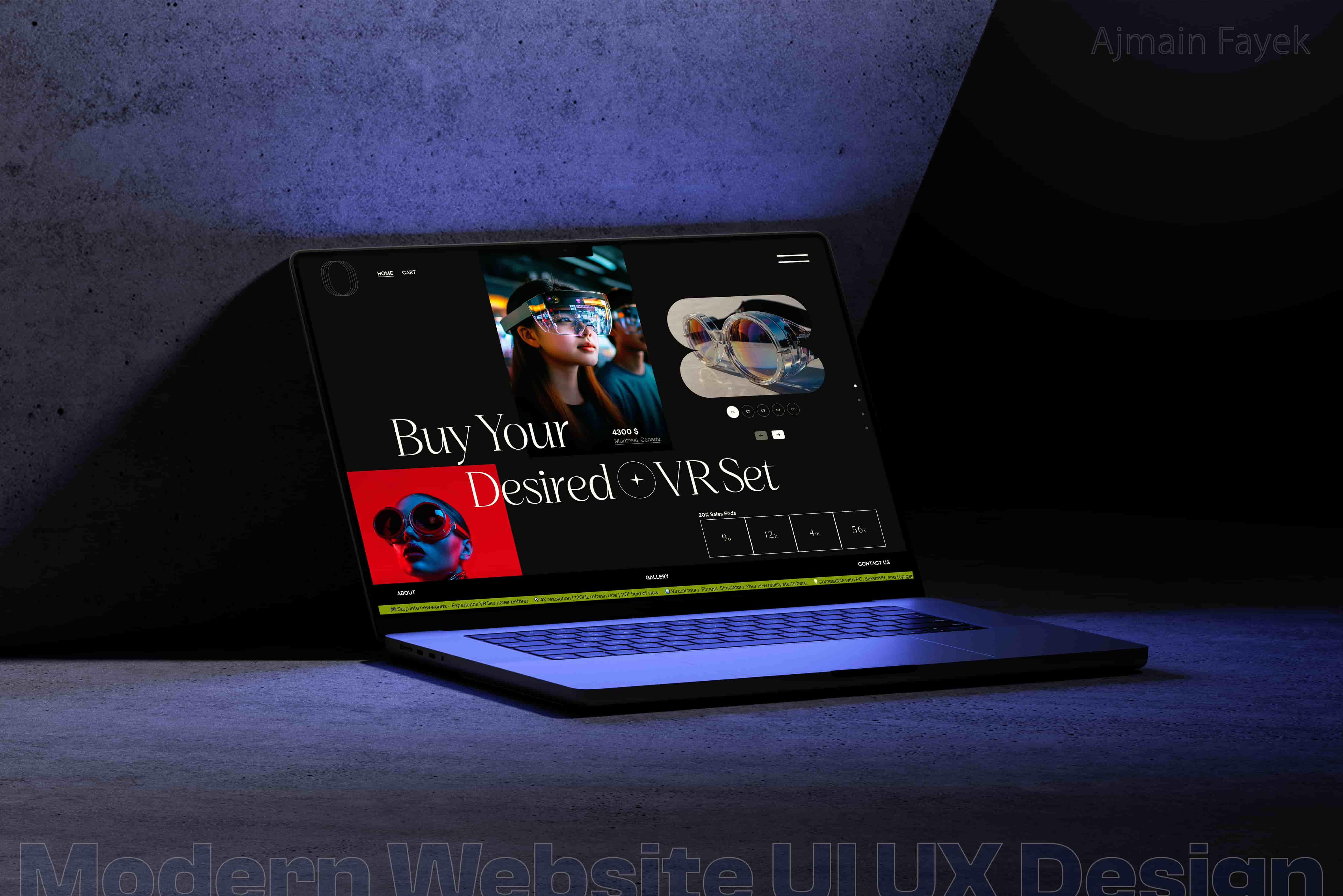
Typography in UI: Making Text Look & Feel Right
Typography is more than just selecting fonts—it’s a fundamental pillar of user experience (UX). The right typography enhances readability, accessibility, brand identity, and user engagement. Poor typography, on the other hand, can confuse users, reduce retention, and ultimately impact conversions.
✔ Typography principles for UI/UX
✔ Best font choices for digital interfaces
✔ How to structure typography for hierarchy and readability
✔ Common typography mistakes to avoid
✔ Real-world case studies for effective UI typography

1. Core Principles of Typography in UI Design
🔹 1.1 Readability & Legibility
✅ Readability refers to how easily users can distinguish words and sentences.
✅ Legibility focuses on how clear individual characters are in a typeface.
Best Practices:
- Use sans-serif fonts for digital interfaces (e.g., Inter, Roboto, SF Pro, Helvetica Neue).
- Maintain proper line spacing (1.5x font size) for better readability.
- Ensure color contrast (WCAG guidelines) for accessibility.
🔹 1.2 Font Pairing & Hierarchy
Good font pairing ensures a visually appealing and structured design.
Best UI font combinations:
- Sans-serif + Sans-serif: Roboto + Open Sans (Modern & Clean)
- Serif + Sans-serif: Merriweather + Lato (Professional & Readable)
- Display + Sans-serif: Montserrat + Nunito (Bold & Playful)
✔ Font hierarchy matters! Use:
- H1 (Heading 1): 24-32px (Bold, Primary Font)
- H2 (Heading 2): 18-24px (Medium, Secondary Font)
- Body Text: 14-16px (Regular, Readable Font)
- Captions & Labels: 12px (Subtle, Supportive Text)
🔹 1.3 Line Length & Spacing
Optimal text width improves readability:
- 45-75 characters per line for desktop.
- 30-40 characters per line for mobile.
- Line height: 1.4x - 1.6x the font size for optimal spacing.
📌 Case Study: Google Material Design recommends a 4px baseline grid for consistent typography scaling across platforms.
2. Choosing the Right UI Typography for Digital Interfaces
🟢 Best Free Fonts for UI Design
✔ Inter – Best for modern web apps & dashboards
✔ Poppins – Ideal for bold & elegant branding
✔ Lato – A clean, professional sans-serif
✔ Work Sans – Great for digital readability
🔗 Google Fonts – Find & download free web-friendly fonts.
🔵 Best Premium Fonts for UI
✔ Proxima Nova – Sleek & professional (Used by Medium, Buzzfeed)
✔ GT America – Modern, geometric (Used in fintech & startups)
✔ Averta – Clean UI font for dashboards & SaaS apps
🔗 Fonts.com – Explore premium fonts for UI.
3. Accessibility & Typography: Ensuring Inclusive UX
🟡 3.1 WCAG Guidelines for Readable Typography
Accessibility is critical in UI design. Follow these rules:
- Minimum font size: 16px for body text.
- Color contrast ratio: At least 4.5:1 for small text, 3:1 for large text.
- Avoid all-caps for long sentences (reduces readability for dyslexic users).
- Use true bold for emphasis instead of italics.
🔗 WebAIM Contrast Checker – Ensure your colors meet accessibility standards.
🟢 3.2 Responsive Typography for Different Devices
Typography must scale across devices:
- Use rem/em units instead of pixels for better responsiveness.
- Implement fluid typography (CSS clamp function) to adjust font sizes dynamically.
- Consider device breakpoints:
- Desktop: 18-22px body text
- Tablet: 16-18px body text
- Mobile: 14-16px body text
📌 Case Study: Apple’s SF Pro dynamically adjusts font weights based on screen size, improving readability across devices.
4. Common Typography Mistakes & How to Fix Them
🚫 Mistake 1: Using Too Many Fonts
🔹 Fix: Stick to a 2-3 font maximum for consistency.
🚫 Mistake 2: Poor Line Height & Letter Spacing
🔹 Fix: Use 1.5x font size for line height and adjust tracking for clarity.
🚫 Mistake 3: Low Contrast Text
🔹 Fix: Ensure sufficient color contrast for readability.
🚫 Mistake 4: Ignoring Mobile Readability
🔹 Fix: Implement fluid typography and test across devices.
5. Real-World UI Typography Case Studies
📌 Case Study 1: Medium.com – Enhancing Readability with Line Spacing
- Medium increased line height & paragraph spacing to improve long-form readability.
- Result: Higher engagement & lower bounce rates.
📌 Case Study 2: Airbnb – Using Custom Typography for Brand Identity
- Airbnb introduced Cereal, a custom font optimized for both print & web.
- Result: Stronger brand recognition & better UX.
Final Thoughts: Mastering UI Typography for Better UX
Typography is a powerful tool that influences user experience, branding, and accessibility. Follow the best practices in this guide to enhance readability, create visually appealing designs, and improve usability.
🚀 Action Steps:
✔ Choose a consistent, web-friendly font for your UI.
✔ Optimize line height, spacing, and contrast for readability.
✔ Use responsive typography techniques to adapt across devices.
✔ Follow WCAG accessibility standards for inclusive design.